The Website Responsive Checker shows one web page on 14 real screen sizes at the same time: four phones, four tablets, four laptops and two big monitors, each drawn at its true width. Type an address and you can see at once whether the page fits a small phone, squeezes on a tablet or looks lost on a wide monitor. It also works for sites that refuse other checkers, for HTML code you paste in, and for up to 50 pages in one run.
The Fitting Room: Every Part of the Website Responsive Checker
Think of the checker as a fitting room for web pages. You bring one page, try it on fourteen screen sizes at once, and look in the mirror to see where it pinches. This guide follows that visit in order. The first three sections get most people what they came for in a few minutes; the rest are the tailoring. Prefer to watch first? The three-minute video below walks through a whole fitting.
One word before we start. A page is “responsive” when it rearranges itself to fit the screen it lands on: one column on a phone, two or three on a laptop, with no text running off the edge. Dragging your own browser window narrower gives a rough idea, but real phones have exact widths and their own habits. This checker draws the page at those exact widths, side by side. Other sites call the same kind of tool a responsive design checker or a screen size simulator.
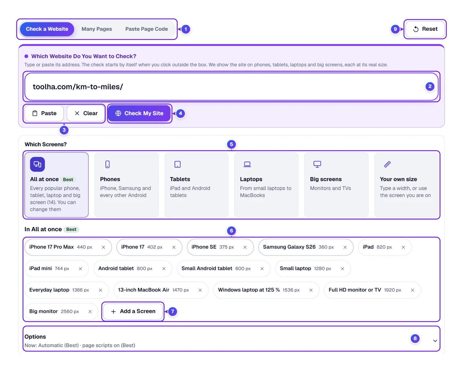
- 1 The three tabs: Check a Website for one address, Many Pages for a list, and Paste Page Code for HTML that isn’t online yet.
- 2 The address box. A short address such as toolha.com is enough; you don’t have to type the https:// part.
- 3 Paste drops in what you copied, and Clear empties the box. An Undo button appears for a moment after Clear, in case your finger slipped.
- 4 Check My Site starts the check. Enter works too, as does a click anywhere outside the box.
- 5 Which Screens? picks a group: All at once, Phones, Tablets, Laptops, Big screens or Your own size.
- 6 The screens that All at once will show, each with its width in pixels and a small × to take it out.
- 7 Add a Screen opens the full list when a size you need is missing.
- 8 Options decides how a page is shown. The grey line under the word tells you what is set right now.
- 9 Reset returns every choice to its starting setting.
Watch the Fitting: The Checker in Three Minutes
Some things are easier to see than to read. This three-minute video runs real checks from start to finish: wikipedia.org on fourteen screens, github.com shown as our copy, a small yoga page whose timetable spills off every phone, and three pages checked in one go. It suits anyone who wants to see the whole fitting once before trying it on their own site.
In This Video
- 0:00 Welcome and open the Website Responsive Checker
- 0:33 Check a website
- 0:45 Look at every screen
- 1:05 Scroll together, Bigger and Turn
- 1:28 Sites that refuse other checkers
- 1:42 Which screens and any screen width
- 2:05 Check your page code before it goes live
- 2:24 Many pages and your own phone
- 2:44 The step-by-step guide
First Fitting: Check a Website on 14 Screens at Once
Pick any page you care about: your shop’s home page, a blog post, the menu of your favorite diner in Chicago. Then:
- Click the address box and type or paste the address, for example toolha.com/km-to-miles/.
- Press Check My Site (or Enter).
- Watch the bar at the bottom of the window. It counts the screens as they load, “N of 14 screens ready”, and turns from blue to green. When it reaches 100 %, every screen is drawn.
- Scroll down and look at each screen, phones first.
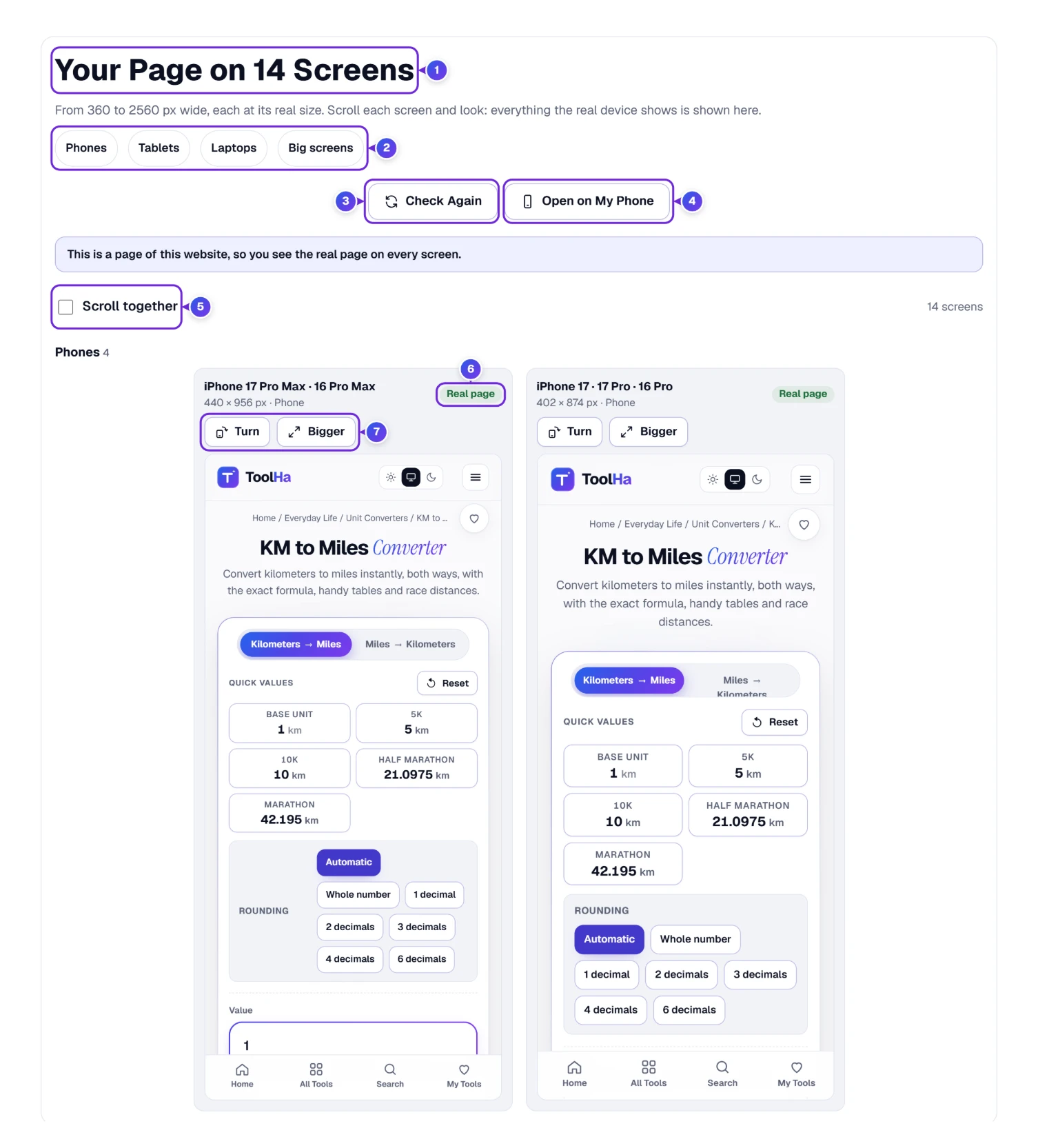
The title 1 says how many screens you are looking at, and the grey line under it gives the range, “From 360 to 2560 px wide”. The four group buttons 2 jump down to Phones, Tablets, Laptops or Big screens, which saves a lot of scrolling on a long page. Check Again 3 reloads every screen after you have changed something on your site, and Open on My Phone 4 is explained under The Real Mirror, further down.
Each screen sits in its own card with the device name and size on top, for example “iPhone 17 Pro Max · 16 Pro Max, 440 × 956 px”. The card is not a picture. It is the page itself, so you can scroll inside it and open its menu, just as you would on that phone.
No result at all? Read the line under the address box. Typing “hello” gives “That does not look like a website address. Try something like example.com.” An address with a user name and password in it is refused too, on purpose.
Look in the Mirror: Read Each Screen the Way a Visitor Would
The checker doesn’t grade your page or hand out a score. It shows you what each device shows, and you decide. Here is what to look at on every card.
- The tag in the corner 6. Real page means you see the live website in a frame. Our copy means the site doesn’t allow that, so our server read the page once and your browser draws that copy. Behind the Curtain, below, explains when each is used.
- Turn 7 swaps width and height, so a phone lies on its side (landscape mode). The iPhone SE goes from 375 × 667 to 667 × 375. Many menus change at that point, so it is worth one click per phone. Laptops and monitors have no Turn button, since nobody turns those.
- Bigger 7 opens one screen over the whole window, as large as it fits. Press Esc or Close to go back. It is the easiest way to read small print on a big-monitor screen.
- Scroll together 5 links all the screens. Tick it, then scroll any one screen, and the others follow to the same part of the page. That is how you compare one section, say the price list, on a phone and a laptop side by side. You may know this as synchronized scrolling or sync scroll on other tools.
What counts as a problem? Mostly three things, and they’re easy to spot by eye: text or a picture cut off at the right edge, a page you can drag sideways on a phone, and buttons so close together that a thumb would hit two. If you see one of those on a phone card, you have found the thing to fix.
Pick Your Sizes: Choose the Phones, Tablets and Laptops You Care About
All at once is the starting choice, and for most pages it is the right one. It shows the 14 sizes marked Popular, the ones most people in the United States browse on, so a page that works on all of them is very likely to work for most of your visitors. Sometimes you want something else, though: only phones, a tablet your customers love, or the exact monitor on your desk.
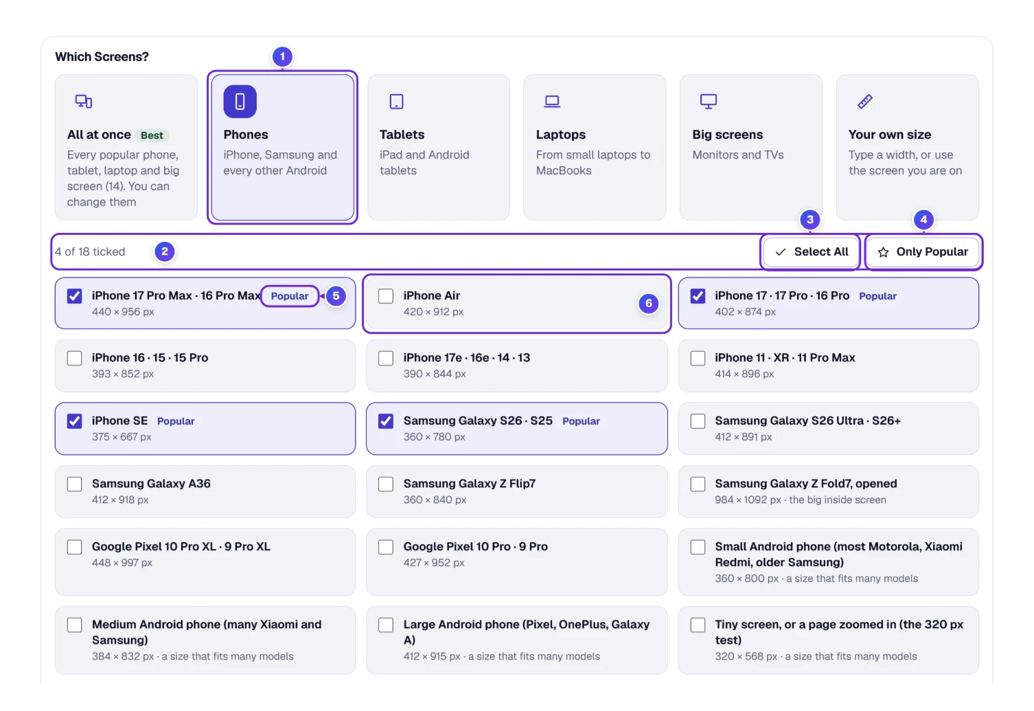
- Under Which Screens?, click a group such as Phones 1.
- Read the count 2 (“4 of 18 ticked”) and tick or untick the sizes you want. An unticked card 6 such as iPhone Air is left out.
- Select All 3 ticks the whole group; press it again to untick everything and start from zero.
- Only Popular 4 goes back to the sizes with the Popular tag 5.
- Press Check My Site again to see the page on your new choice.
The phone list has 18 sizes, from the iPhone 17 Pro Max (440 pixels wide) to the Samsung Galaxy Z Fold7 opened up (984). Some cards are not one model but a common size, such as “Small Android phone (most Motorola, Xiaomi Redmi, older Samsung)” at 360 wide. The last one, “Tiny screen, or a page zoomed in”, is 320 wide: the width a page should still work at for someone who zooms the text way up.
To change All at once itself, use the × on a screen to take it out, or Add a Screen 7 to bring one in. “All at once: back to the Best screens” restores the original 14 in one click.
Made to Measure: Add the Exact Size of Your Own Screen
Your own size is for a width no list has: a kiosk in a hotel lobby, a new monitor, or a customer who says “it looks broken on my screen” and tells you its width.
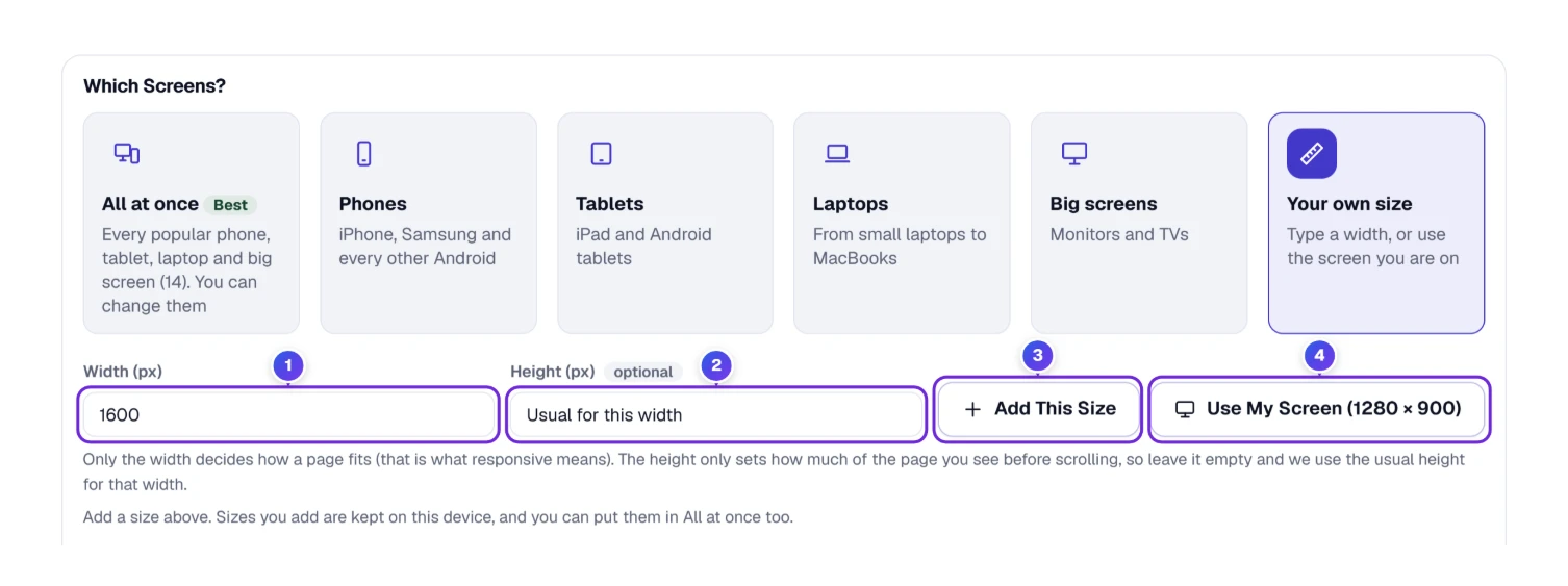
- Click Your own size under Which Screens.
- Type the width in pixels 1, for example 1600.
- Leave the height 2 empty unless you need it. Only the width decides how a page fits; the height just sets how much of the page you see before scrolling, so the checker picks the usual height for that width.
- Press Add This Size 3. Or press Use My Screen 4 to add the window you are using right now (a phone or tablet gives its whole screen size).
Sizes you add are remembered by this browser, and you can add them to All at once too.
Behind the Curtain: Real Page, Our Copy and “Refused to Connect”
Many big websites forbid other pages from showing them inside a frame. It is a security setting with a technical name (X-Frame-Options, or a Content-Security-Policy rule), and it’s why so many responsive checkers just show a grey “refused to connect” box for sites like GitHub. This checker handles those sites another way: our server reads the page’s code once, and your browser draws it in a locked box with the site’s own pictures, styles and scripts. Links, forms and pop-ups are switched off inside it.
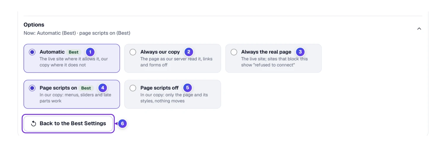
- 1 Automatic (the Best choice) shows the live site where it allows it and our copy where it doesn’t.
- 2 Always our copy uses the copy everywhere, even on sites that would allow a frame.
- 3 Always the real page never uses a copy. Sites that block frames then show “refused to connect”, the same as elsewhere.
- 4 Page scripts on lets menus, sliders and parts that load late work inside our copy.
- 5 Page scripts off shows only the page and its styles. Nothing moves, which helps when a script keeps covering the page with a pop-up.
- 6 Back to the Best Settings resets both choices.
We tried this on github.com: all 14 screens came up as Our copy, and the blue bar at the bottom said “You see our copy of this site”. On example.com and on our own pages, every screen was the Real page. The video shows the same github.com check at 1:28.
There is one more reason for a copy. A page needs one line in its code, the viewport line, before a phone will fit it to the screen. Without that line, phones draw the page about 980 pixels wide and shrink it until everything looks tiny. A frame on a computer can’t copy that habit, so the checker draws such pages 980 wide on the phone and tablet screens and shrinks them, exactly like a phone. The very first website, info.cern.ch, has no viewport line. In our test its 8 phone and tablet screens used our copy, drawn 980 wide, while the 6 laptop and big screens showed the real page. The bottom bar still gave the general reason (“The site does not let other pages show it”), which isn’t quite the story for that page, so trust the tiny text on the phone cards rather than the bar.
Between Two Sizes: Slide Through Every Width From 320 to 2560 Pixels
Fourteen screens catch most problems, but a layout can also break at a width between two of them, say 600 pixels, where a menu switches from one style to another. See Any Screen Width, under the screens, lets you find that spot.
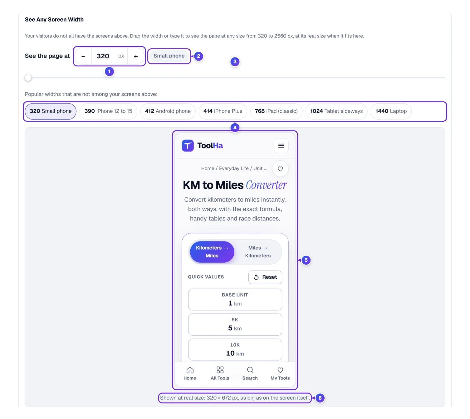
- Drag the slider 3 slowly from left to right, or type a width in the box 1 and use − and + to move 10 pixels at a time.
- Read the kind of screen 2 next to the number. At 320 it says “Small phone”.
- Use a quick width 4 to jump to a popular size that isn’t among your screens above, for example “768 iPad (classic)” or “1440 Laptop”.
- Look at the page 5 as it redraws, and read the line under it 6.
The line 6 tells you how true to life the picture is. At 320 we got “Shown at real size: 320 × 672 px, as big as on the screen itself.” At 2560 the window can’t hold the full width, so it said “Shown at 25 % of real size (2560 × 900 px), so the whole width fits here.” The page is still drawn at 2560; it is only shrunk for your eyes.
Still in the Workshop: Test HTML Code Before It Goes Live
You don’t need a live website for this part. Paste Page Code takes the HTML of a page you are still building on your own computer, a page behind a login, or one our server can’t open. Nothing you paste is sent to our server. You can watch a pasted page spill off every phone at 2:05 in the video.
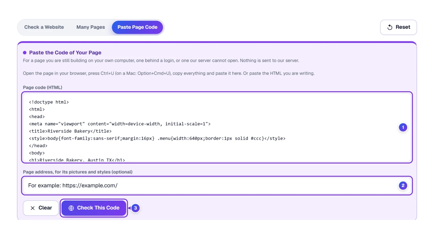
- Click the Paste Page Code tab at the top.
- Paste the whole page into the code box 1, from <!doctype html> to </html>. To get the code of a page you can see in your browser, press Ctrl+U (Option+Cmd+U on a Mac), then select all and copy.
- If the page uses pictures or styles from its own website, type that address in the second box 2, so they can load. It is optional.
- Press Check This Code 3. The screens appear right under the code box, and Check Again checks the code again after you edit it.
Here is a test we ran. We pasted a tiny page for an example bakery in Austin, Texas: a heading, one sentence and a price table set to a fixed 640 pixels wide. The note “Showing the code you pasted, in our locked box.” appeared, and on the 440-pixel iPhone 17 Pro Max the last column, Notes, was cut off at the right edge. On the 402-pixel iPhone 17 even the Weight column was cut. A fixed width wider than the phone is one of the most common reasons a page “doesn’t fit”, and two minutes with this tab shows it before any customer does.
When the part that sticks out is a table, the fix is to let it scroll inside its own box or to stack each row on small screens. If you build tables by hand, the HTML Table Generator writes that phone behavior into the code for you.
Try an Example fills an empty box with a ready-made page, a good first run before you paste your own. It hides as soon as the box has your own code in it, as in the picture, so a stray click can’t replace your work. Clear, next to Check This Code, empties the box.
The Whole Wardrobe: Check a List of Pages in One Go
A site is more than its home page. The contact form, the longest blog post and the checkout page are often where a layout gives way. Many Pages checks up to 50 addresses one after another.
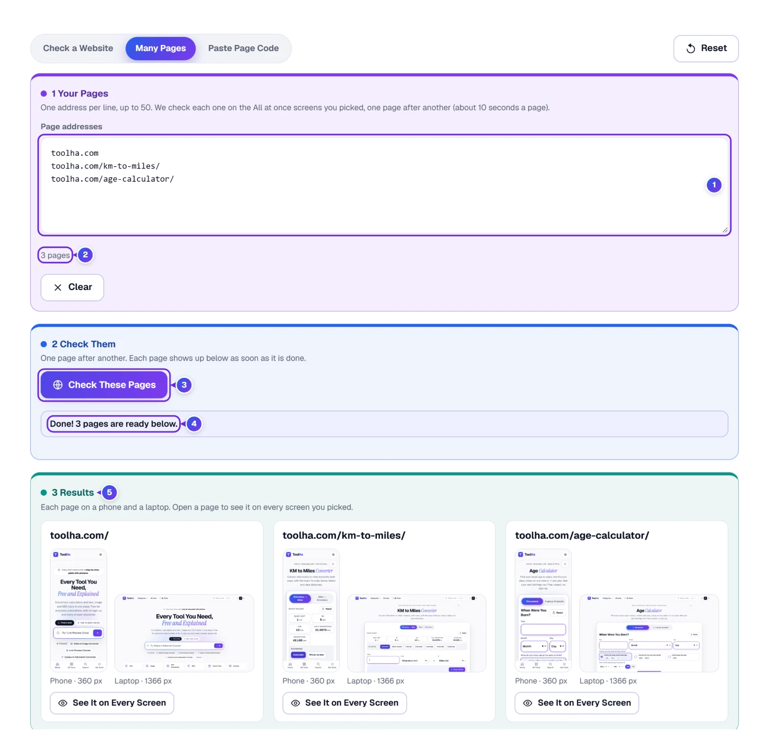
- Open the Many Pages tab.
- Put one address per line in the box 1. The count 2 under it updates as you type.
- Press Check These Pages 3. Stop halts the run if you change your mind.
- Each page shows up under Results 5 as soon as it is done, at phone size (360 px) and laptop size (1366 px). Press See It on Every Screen on any page to open it on all your screens.
Our run with three ToolHa pages (the home page, KM to Miles and the Age Calculator) finished with “Done! 3 pages are ready below.” in about half a minute, close to the “about 10 seconds a page” the tool promises.
Stuck Zippers: When a Site Blocks Checkers or Loads Half Empty
Two kinds of sites need an extra step, and the checker tells you about both in a bar at the bottom of the window.
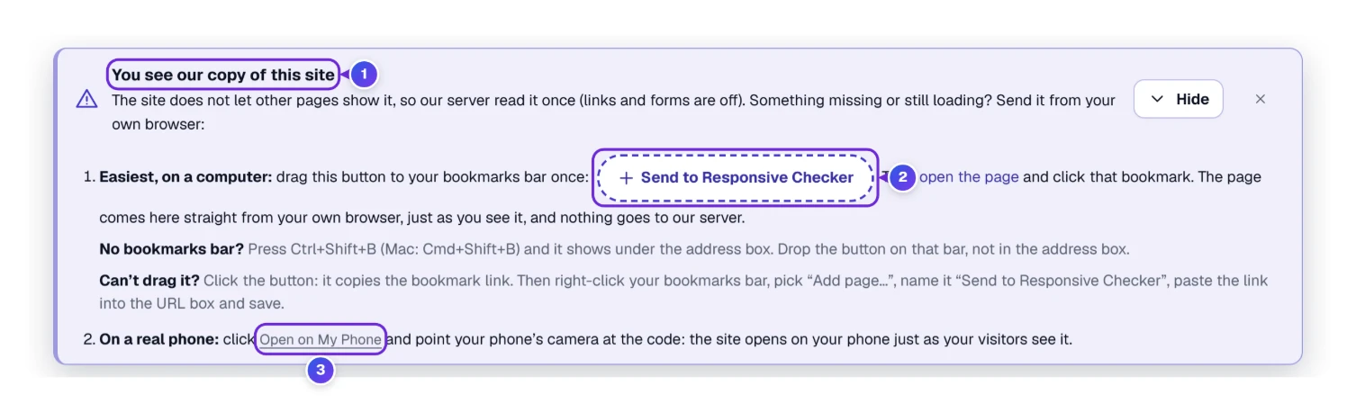
- “This page did not load fully in our copy” (yellow). Some sites fill in their content with scripts after the page opens: grey boxes, empty lists, prices that never arrive. Our test on airbnb.com showed exactly that. It is not a fault of the site; it is the limit of any copy.
- “This website blocks checking tools”. A few sites stop every robot at the door, ours included. We don’t sneak past that.
- “You see our copy of this site” (blue) is only for your information: the screens are fine, and the bar tells you how to see more.
The fix for both cases is the same: send the page from your own browser, where you can already see it. Press Show How in the bar 1, then:
- Drag the Send to Responsive Checker button 2 to your bookmarks bar, once. No bookmarks bar? Press Ctrl+Shift+B (Cmd+Shift+B on a Mac) to show it.
- Open the site in another tab, the normal way.
- Click that bookmark. The page arrives in the checker just as you see it, straight from your browser, and nothing goes to our server.
Can’t drag it? Click the button instead: it copies the bookmark link, and you add a bookmark by hand with that link. The bar also points to Open on My Phone 3, explained in the next section. When a site blocks checking tools, it adds one more way: the code route from the Workshop section (Ctrl+U on the page, copy everything, paste it into Paste Page Code).
The Real Mirror: Hold the Page in Your Own Hand With a QR Code
A checker on a computer is very close to a phone, but it isn’t the phone. Real phones add their own browser bars at the top and bottom, use their own fonts and settings, and Safari and Chrome draw a few things differently. The last check belongs in your hand.
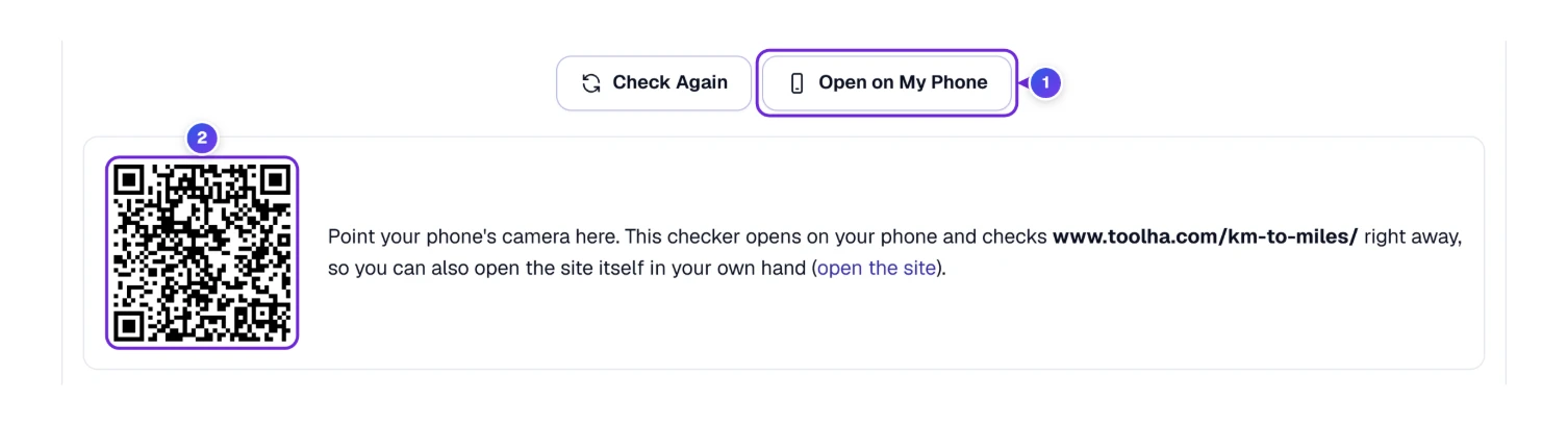
- Press Open on My Phone 1, above the screens.
- Point your phone’s camera at the code 2. Most iPhones and Android phones read it with the normal camera app.
- Tap the link that pops up. Your phone then shows the checker, already loaded with your site.
From there you can open the site itself on the phone too, and compare. If the phone and the matching screen in the checker disagree, believe the phone.
The Checker in Your Pocket
The checker works on a phone too, which is useful when a client sends you a link while you’re out. The parts stack in one column: tabs, address, screens, results.
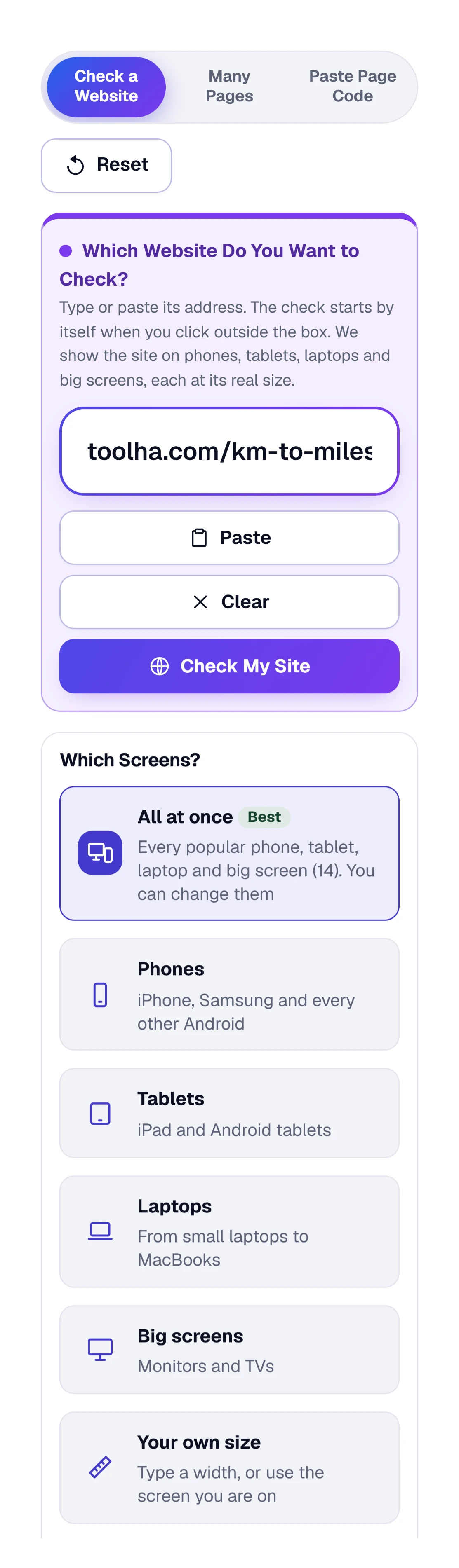
Each screen is shrunk to fit the phone, so a laptop screen becomes small. Use Bigger to see one screen at a time, and turn your phone sideways for the wide screens. For real work on a big site, a computer is still the more comfortable place.
Quick Alterations: Single-Letter Keys and Your Recent Checks
Once the fitting room feels familiar, a few keys save trips to the mouse. They work whenever your cursor isn’t inside a text box.
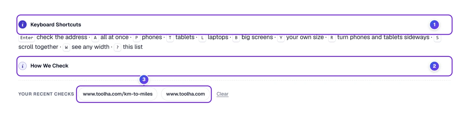
| Key | What it does |
|---|---|
| Enter | Checks the address in the box |
| A | All at once |
| P, T, L, B | Phones, Tablets, Laptops, Big screens |
| Y | Your own size |
| R | Turns every phone and tablet on its side |
| S | Scroll together on or off |
| W | Jumps to See Any Screen Width |
| ? | Opens this list |
Your recent checks 3 keeps the last addresses you checked as buttons. Click one to check it again, or use Clear to empty the list. Like your options and your own sizes, the list is kept only by this browser, on this device.

- 1 Save puts the checker in My Tools (the heart at the top of every page), so you can find it again in a second.
- 2 Share passes a link to this checker through any app on your device, useful when your web designer should run the same check.
- 3 Embed hands you a short code snippet, so the checker can live inside a site you run.
- 4 On your phone gives a scannable square that opens this page and nothing else. Open on My Phone, from The Real Mirror, is the better choice when you also want your site loaded.
- 5 Print prints the page with the screens as they are.
- 6 The five stars are where you rate the checker.
Where the Screen Sizes Come From, and Why Other Checkers Disagree
Every size in the checker is in CSS pixels, the unit web pages are built in. A phone with a sharp screen packs 2 or 3 real dots into each CSS pixel, which is why an iPhone with a screen 1,320 dots wide reports 440. The sizes come from the makers’ own screen specs, and the Popular tag marks the sizes used most in the United States according to StatCounter’s screen statistics.
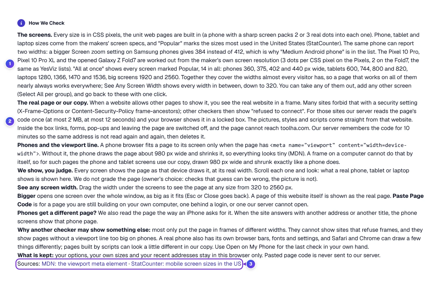
- Why 14 screens. All at once covers phones 360, 375, 402 and 440 pixels wide, tablets 600, 744, 800 and 820, laptops 1280, 1366, 1470 and 1536, and big screens 1920 and 2560. Together they cover the widths most visitors use.
- Why 320 matters. The W3C accessibility rule on reflow (WCAG 2.2, success criterion 1.4.10) asks that a page work at 320 CSS pixels wide without sideways scrolling. That is the same as a 1280-pixel window zoomed to 400 %, so it protects people who enlarge text.
- Why the viewport line matters. A phone fits a page to its screen only when the page has <meta name=”viewport” content=”width=device-width”>, as MDN explains. Without it you get the shrunken 980-pixel page from Behind the Curtain.
- Why Google cares. Google indexes the mobile version of a page first, and its own guidance says the mobile page should have the same content as the desktop one; it recommends responsive design as the easiest way to get there. Google retired its old Mobile-Friendly Test tool in December 2023, so a visual check like this one is now a normal part of the job.
- Phones get a different page? The checker also reads the page the way an iPhone asks for it. When a site answers with a different address or title for phones, the phone screens show that phone page.
So why might another checker show something else? Many of them only put the page in frames of different widths. They can’t show sites that refuse frames (the “refused to connect” box), and they show pages without a viewport line far too large on phones. Pages built entirely by scripts can also look a little different in any copy. That is why we keep pointing you at The Real Mirror: one look on a real phone settles any doubt.
Loose Threads: Blank Screens, Tiny Text and Other Surprises
| What you see | Why | What to do |
|---|---|---|
| A grey box saying “refused to connect” | Options is set to Always the real page, and the site blocks frames | Choose Automatic (Best) in Options |
| Grey boxes or empty parts in every screen | The site fills them in with its own scripts, which don’t run in a copy | Send the page with the bookmark from Stuck Zippers |
| Everything looks tiny on the phone screens | The page has no viewport line, so phones shrink it from 980 pixels | Add the viewport line to the page; the checker is showing what phones really do |
| “This screen stayed empty in our copy” | Even our copy of this site comes out empty | Try Page scripts off in Options, send the page with the bookmark, or use Open on My Phone |
| A page you can drag sideways on a phone card | Something on the page is wider than the phone, often a table, a picture or a fixed width | Look for the part that sticks out on the right; See Any Screen Width shows where it starts |
| “Please use the plain address of the page…” | The address had a user name or password in it | Remove that part; for pages behind a login use Paste Page Code |
Questions at the Fitting Room Door
How Do I Check If My Website Is Mobile Friendly?
Type the address into the Website Responsive Checker and press Check My Site. Look at the four phone screens: the text should be readable without zooming, nothing should run off the right edge, and you shouldn’t be able to drag the page sideways. Then open it on a real phone with Open on My Phone.
What Replaced Google’s Mobile-Friendly Test?
Google retired the Mobile-Friendly Test and the Mobile Usability report in December 2023. Google still indexes the mobile version of pages first, so checking how a page looks on phones is as important as before; a side-by-side checker and a real phone do that job.
How Can I See My Website on an iPhone Without Having One?
Pick Phones under Which Screens and keep the iPhone sizes ticked, from the iPhone SE (375 pixels) to the iPhone 17 Pro Max (440). Each screen draws your page at that iPhone’s real width. Fonts and the Safari bars can differ a little, so check on a real iPhone when you can.
Why Does My Website Scroll Sideways on Mobile?
Some part of the page is wider than the phone’s screen, often a table, a picture, a video or a box set to a fixed width in pixels. In the checker, find the phone card you can drag sideways and scroll to its right edge; whatever pokes past it is the cause.
Why Do Some Sites Show “Refused to Connect” in a Responsive Checker?
Those sites forbid other pages from showing them in a frame. Our checker reads such pages once on our server and draws a locked copy, so you still see them; only the setting Always the real page shows the refusal.
Can I Test a Page on Localhost or Before It Is Published?
Yes. Copy the page’s HTML and paste it into Paste Page Code. If its pictures and styles live on a public site, add that address in the second box. The code you paste stays in your browser.